
Do you find choosing colors for a new project easy? Challenging? Frustrating? Fun? A necessary evil? I actually really enjoy it. But I’m a born artist, and color comes naturally to me. Often I don’t even give a selection a second thought, I just know it works, or doesn’t.
As a quilt shop employee, I see people struggle with color choices, deliberate long and hard over whether a fabric goes with another fabric, agonize over their choices. That I don’t understand, but I can appreciate that we all don’t see things the same way. I have a brother who has some color-blindness. He doesn’t differentiate between blue/brown/purple, to him they are all the same thing. I cannot fathom what it is like to not see color, or at least, not see all colors.
I’m working on a block exchange this week that requires using batiks; a light, a light-medium, a medium, and a dark. With batik colors, it is hard to determine what tone or shade they are, sometimes, and that is what got me thinking about this post.
I picked out these batiks and laid them out into what I thought fit my four color shades I needed.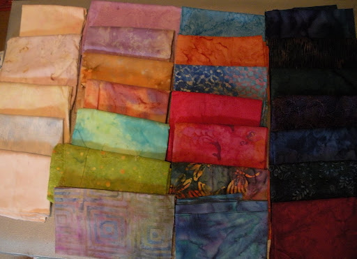
Then I switched my camera to black-and-white, and shot them again:
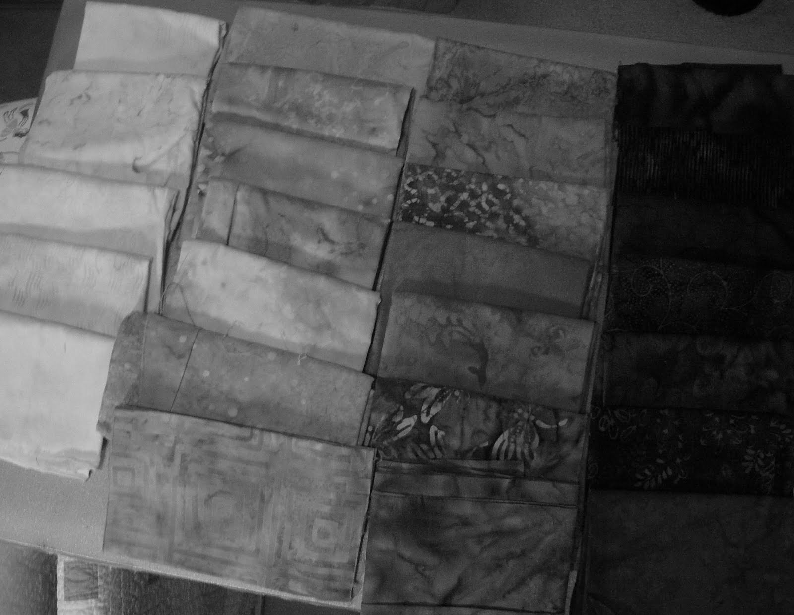
Not bad, but I saw some shades that I didn’t think contrasting quite enough, so I moved them around and shot them again:
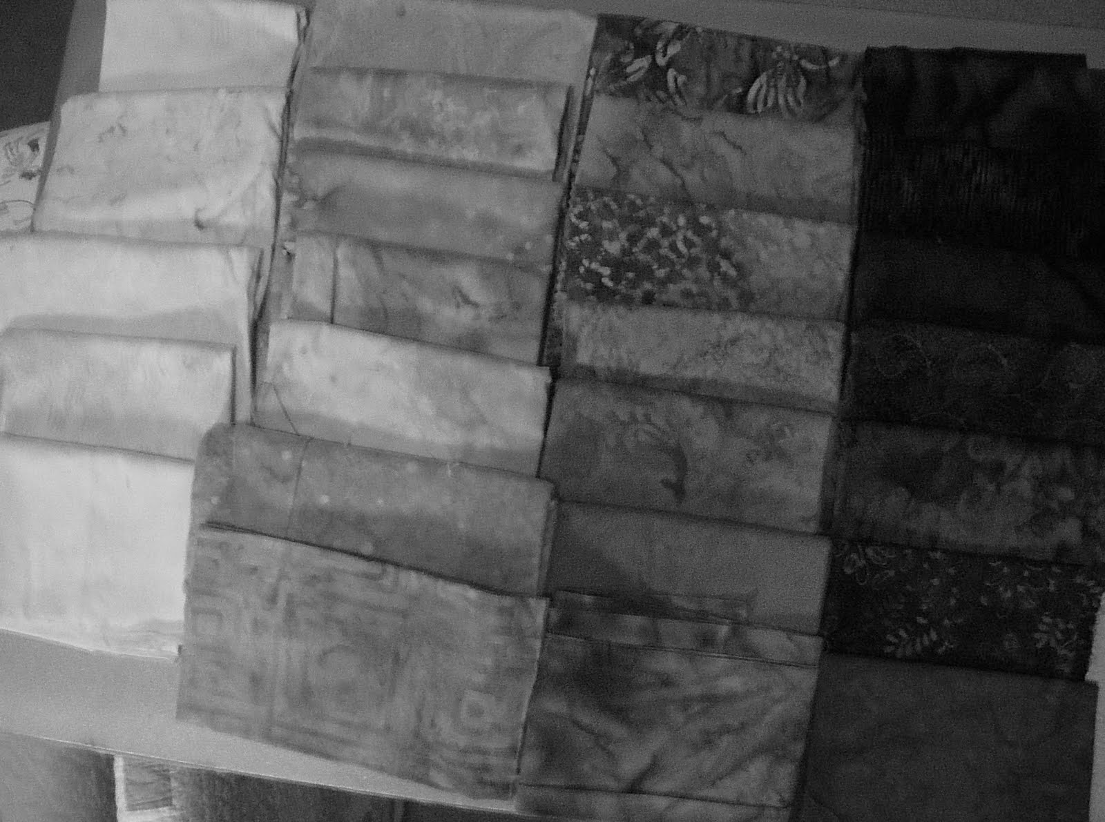
Much better, but I still see some lack of contrast between the two middle rows, so more tweaking. I finally got fours rows of clearly differentiated shades of grey, I was happy with it, so I then cut my blocks out to sew together tonight.
Your black-and-white mode on your camera, or in your photo editing software, is a great way to test the value of your quilt fabrics/blocks for contrast, as well as define shades of your colored fabrics.
Color refers to the wavelength of the light, where it falls on the spectrum; red, blue, green, etc. Shade refers to how dark the color is, to make a color darker, you add black to it. Tint refers to how light the color is, to tint a color, you add white. Tone is a little more challenging, it refers to the blueness of a blue, the redness of a red, etc. For instance, you can have a true, pure blue, or a blue that has a yellow tone; the more of one color you add to the first, the more you alter the tone.
I’ve been playing with another color-filled quilt this week, getting this one ready to go off to the long-arm quilter. It’s full of every color of the rainbow…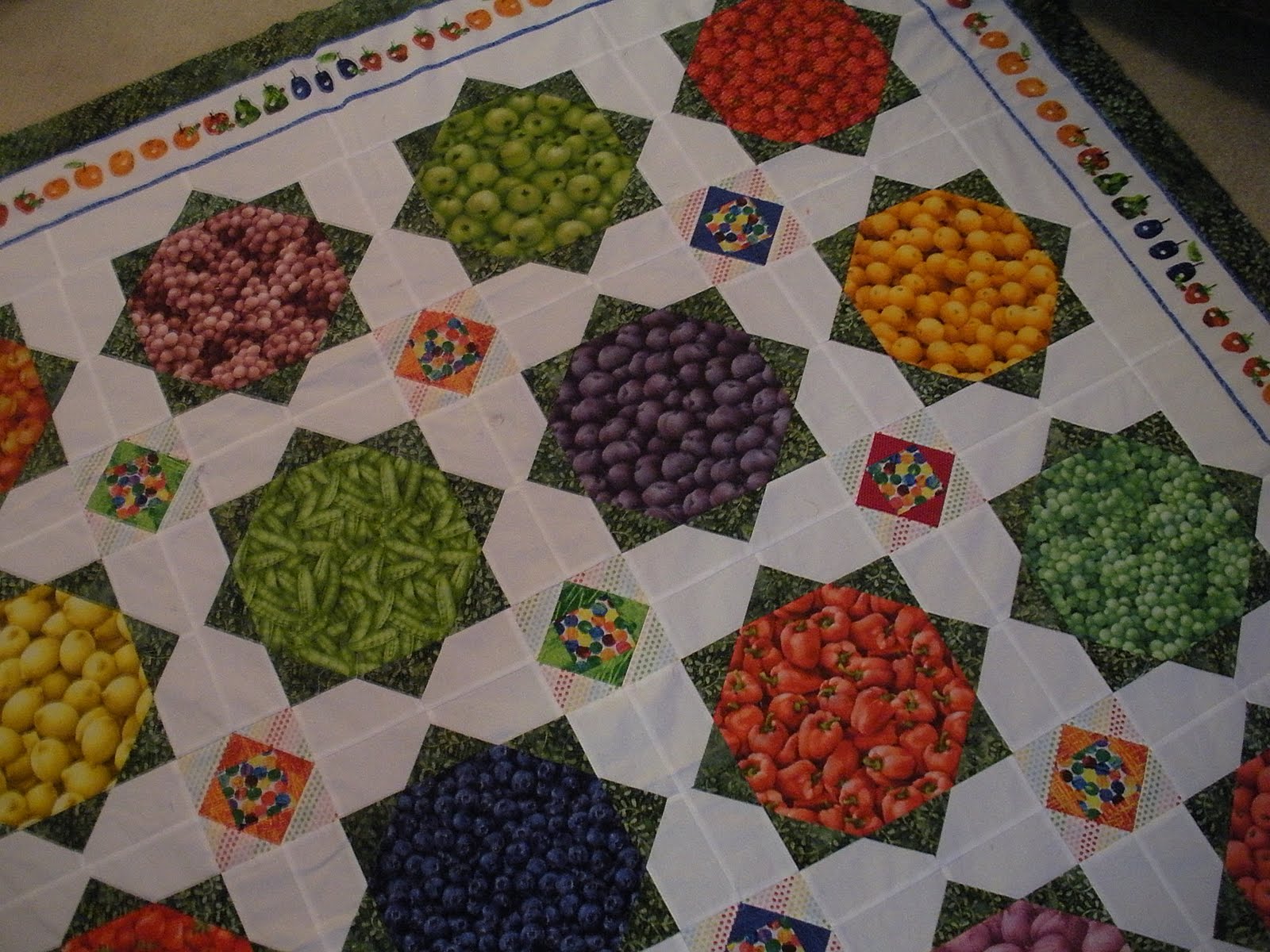
No worries about enough contrast in that one!
Have you struggled with contrast, shade and color selection in your projects? Do you give much thought to it? How do you work towards a satisfying final product in terms of color and contrast? I’d love to hear your thoughts!

What a wonderful quilt….love the name! I've seen those fabrics and that is a delicious way to use them! I am one of those who struggles with color. Math comes easy to me. Wish it were the opposite most of the time!
Love your fruit & veggie quilt, and the cute border. I think my problem with color is that I get fabrics that match too much and don't get enough contrast. I like to get input from the sales staff. But it's good think I don't work at a quilt store, cos I'd never earn enough to pay for all the fabric I would “have to have” LOL
Love those batiks Doris! Like you, I find colour so easy to play with, so much so I love it! But it's also such a fascinating subject area too! Great post 🙂